LOGO
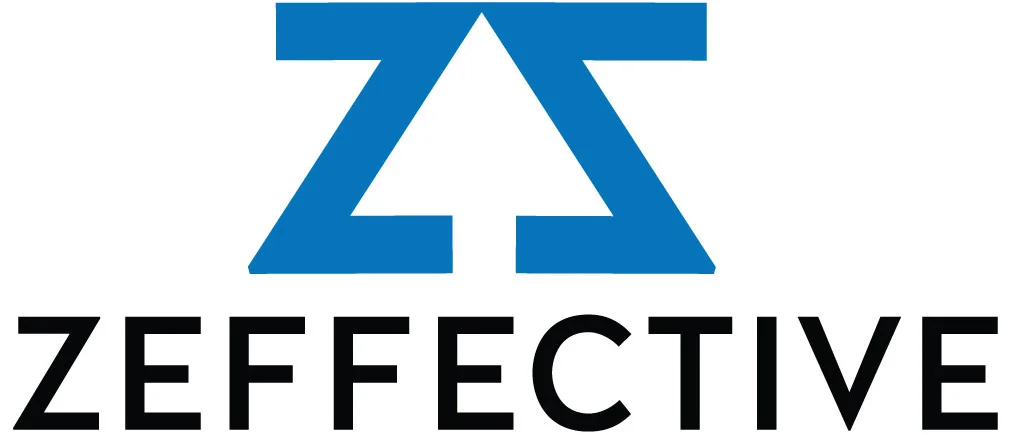
Zeffective helps sites improve their performance through analytics and usability testing. On an analytics dashboard, particularly with metrics like UVs, conversions, and overall traffic, the "up" arrow is what you want to see, which I worked into the negative space.
BRAND STANDARDS AND COLOR GUIDE
Producing a high volume of nuanced proposals, traffic reports, and industry news requires heavy lifting on the part of a brand's color palette. Zach asked me to work on a comprehensive suite that he could reference while building these materials.
DIGITAL STRATEGY
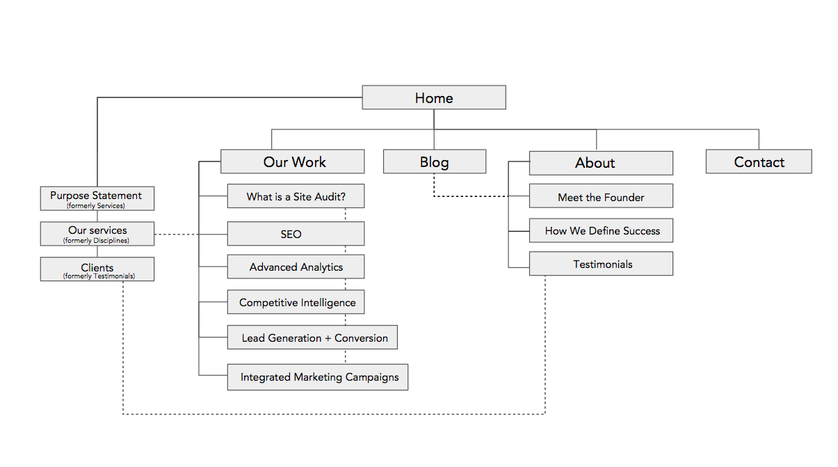
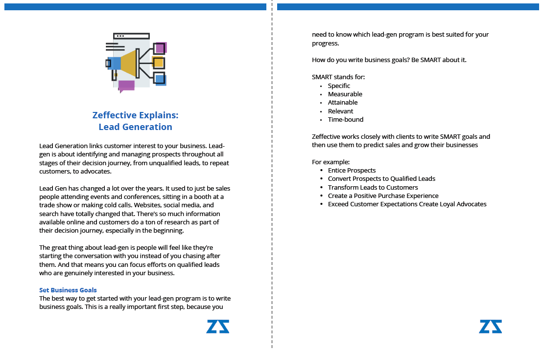
As Zeffective prepared for the relaunch of its website, I was brought in to look at consistency and tone. I chose stock photos, suggested an architecture rework, updated icons to reflect the new palette, created templates for blog posts, proposals, and white papers, and wrote or edited most of the site copy.


